La Taloche
Amplifying feminist & queer voices through a tailored WordPress site with custom code for unique functionality.
Creating a digital presence for a feminist & queer association
Challenge
How can a digital identity reflect feminist and queer values while staying clear, accessible, and engaging?
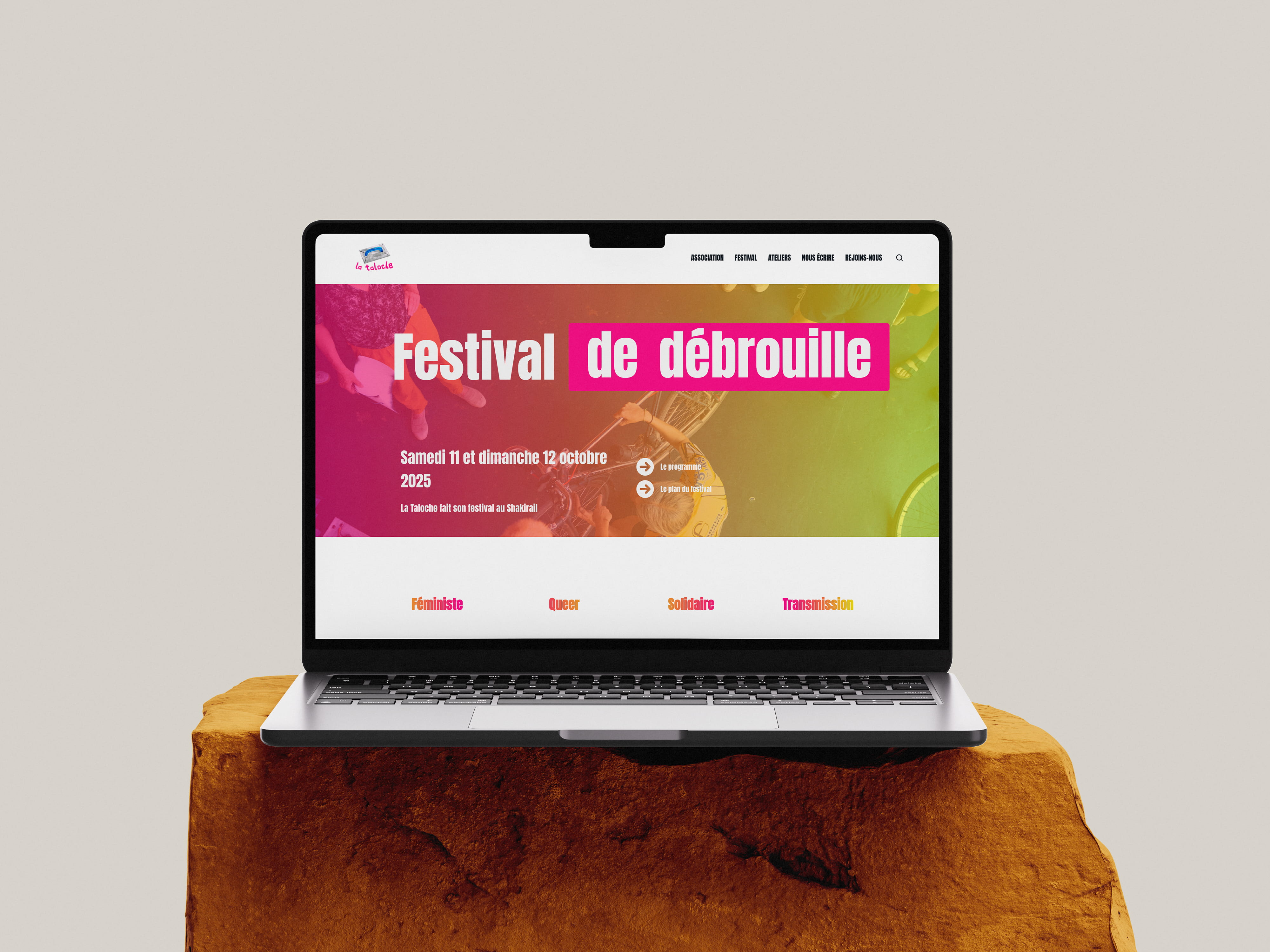
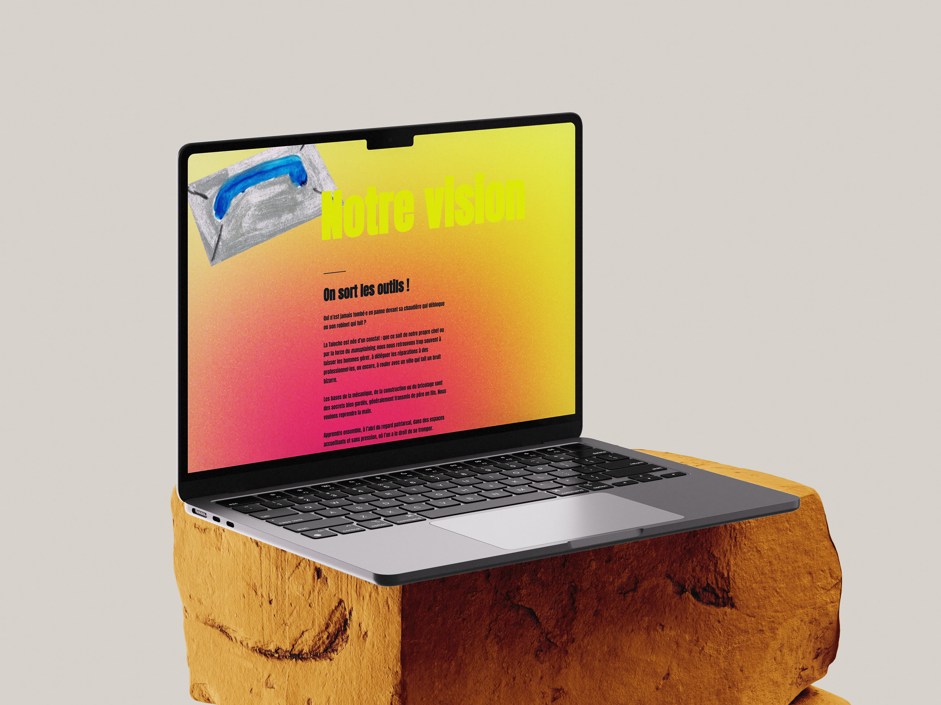
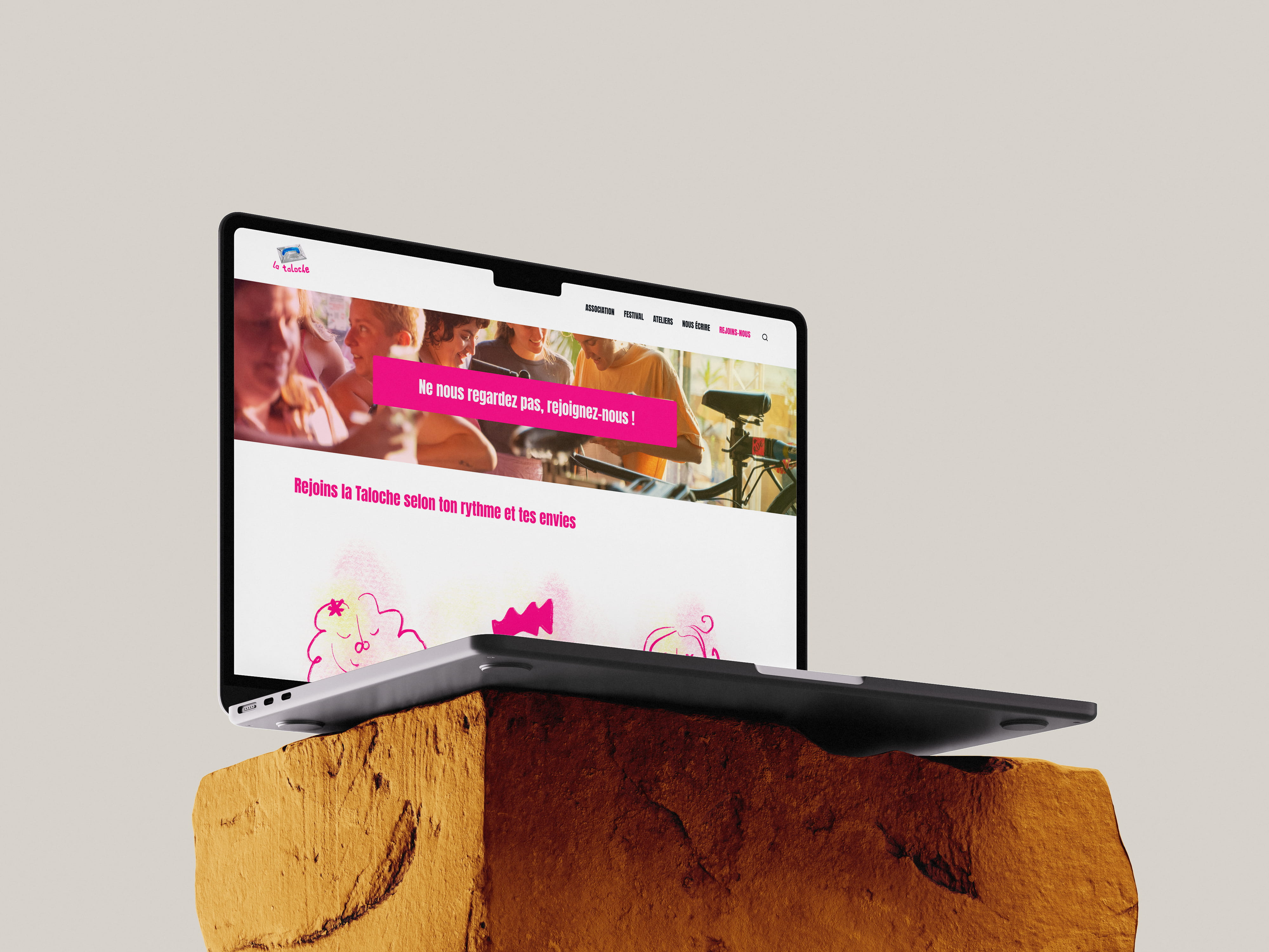
La Taloche, a queer-feminist association, needed a site to launch its first DIY Festival. With only a logo and two colors, I created custom illustrations in Procreate and designed a unique gradient inspired by the association’s visual direction. The website was built on WordPress with custom code, combining accessibility with a strong visual identity.
.jpg)
.png)
No items found.
Results
Delivery of a complete website and visual identity that embodied La Taloche’s values and showcased the festival effectively.
The site guided newcomers, participants, and volunteers through clear navigation, while visuals made inclusivity and solidarity tangible.