.svg)
Mooreish Bakery
A contemporary identity rooted in heritage and hospitality
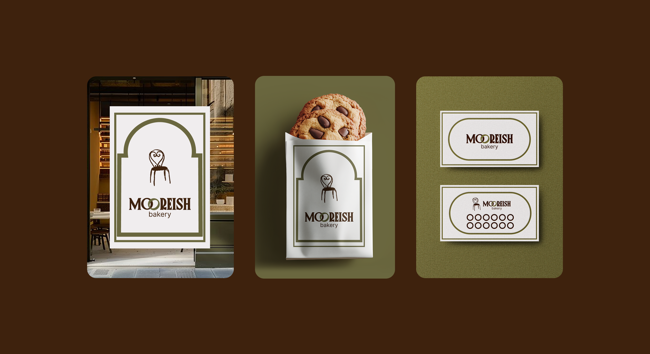
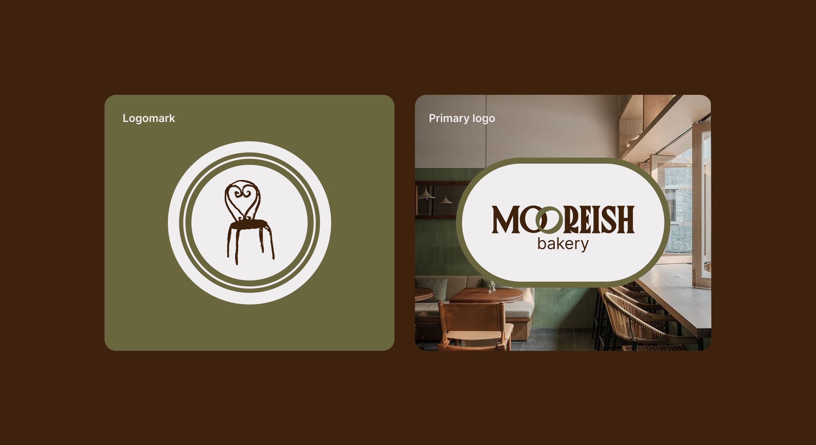
Mooreish is a London-based micro-bakery inspired by its founder’s Moorish heritage. The objective was to create an identity that felt warm, distinctive and artisanal, while remaining contemporary enough to grow across different formats and touchpoints. The visual direction draws on the ideas of gathering, hospitality and sharing food. The interlocking double “O” became a central element of the wordmark, symbolising connection and community, while the chair-inspired logomark creates a welcoming and memorable expression of the brand.
A warm and cohesive brand system
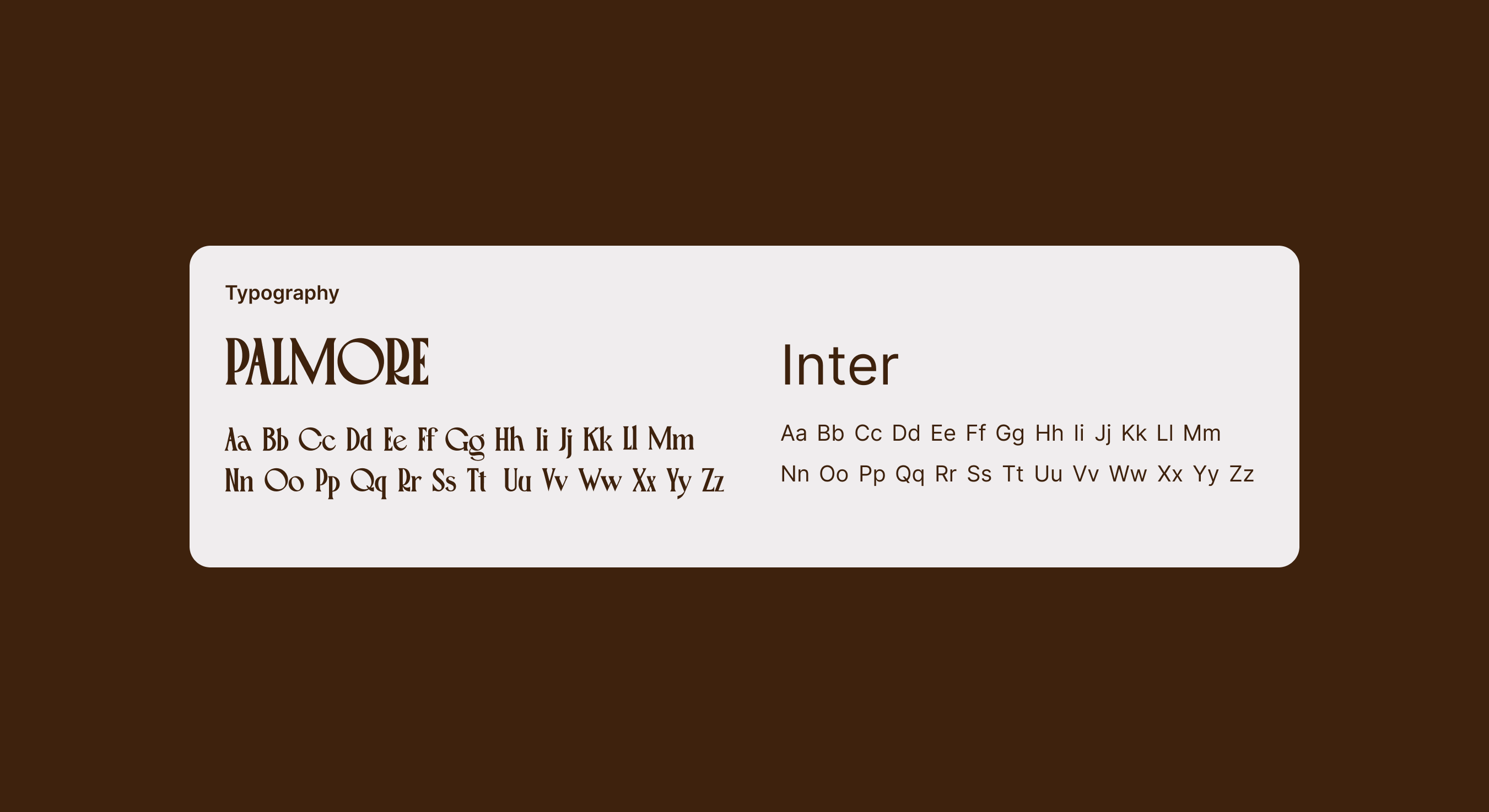
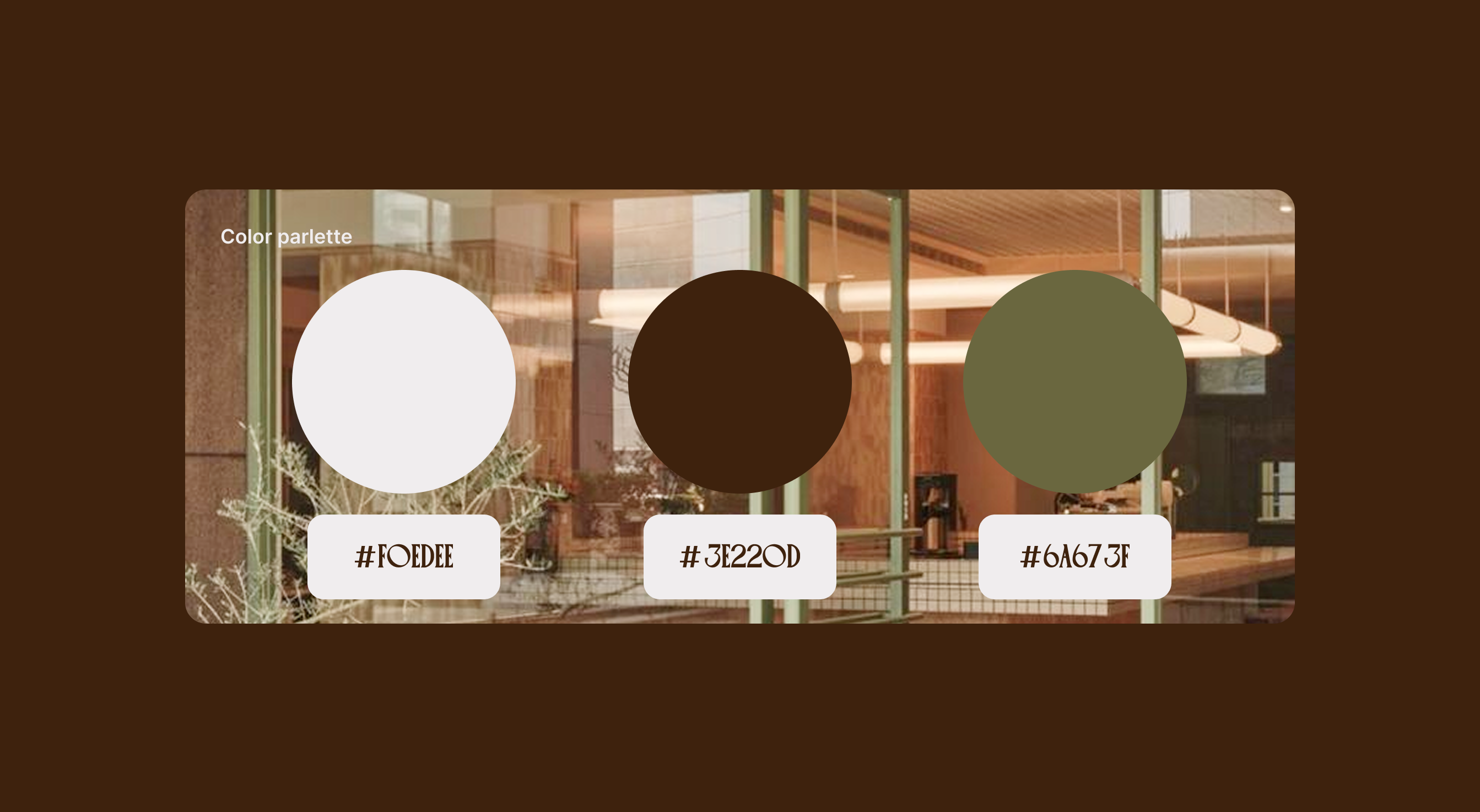
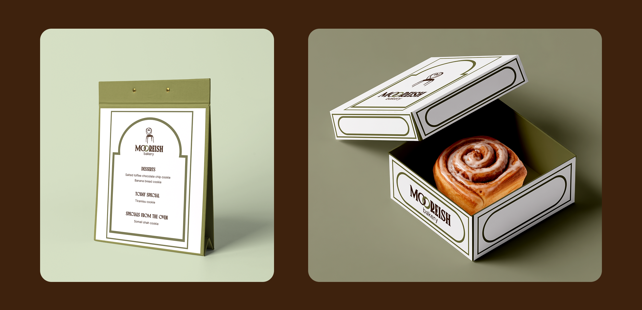
The final identity combines expressive Palmore typography with the clarity of Inter, supported by a rich palette of deep brown, soft cream and muted olive green. Ornamental frames and arch-shaped details reference Moorish visual culture through a refined, contemporary lens. Designed as a flexible system, the identity translates naturally across storefront signage, packaging, labels and printed materials, giving Mooreish a recognisable presence that feels both rooted in heritage and made for today.